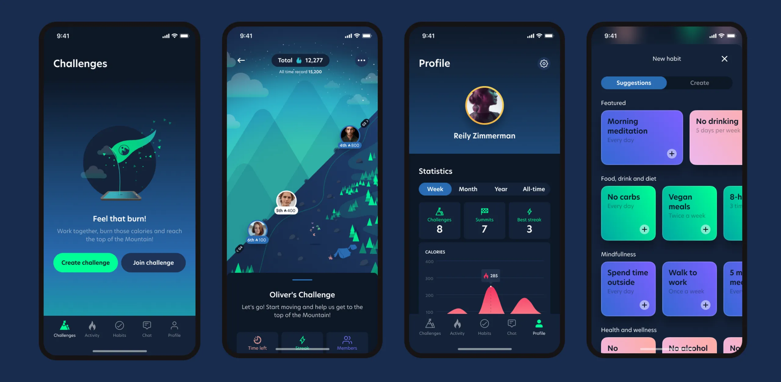
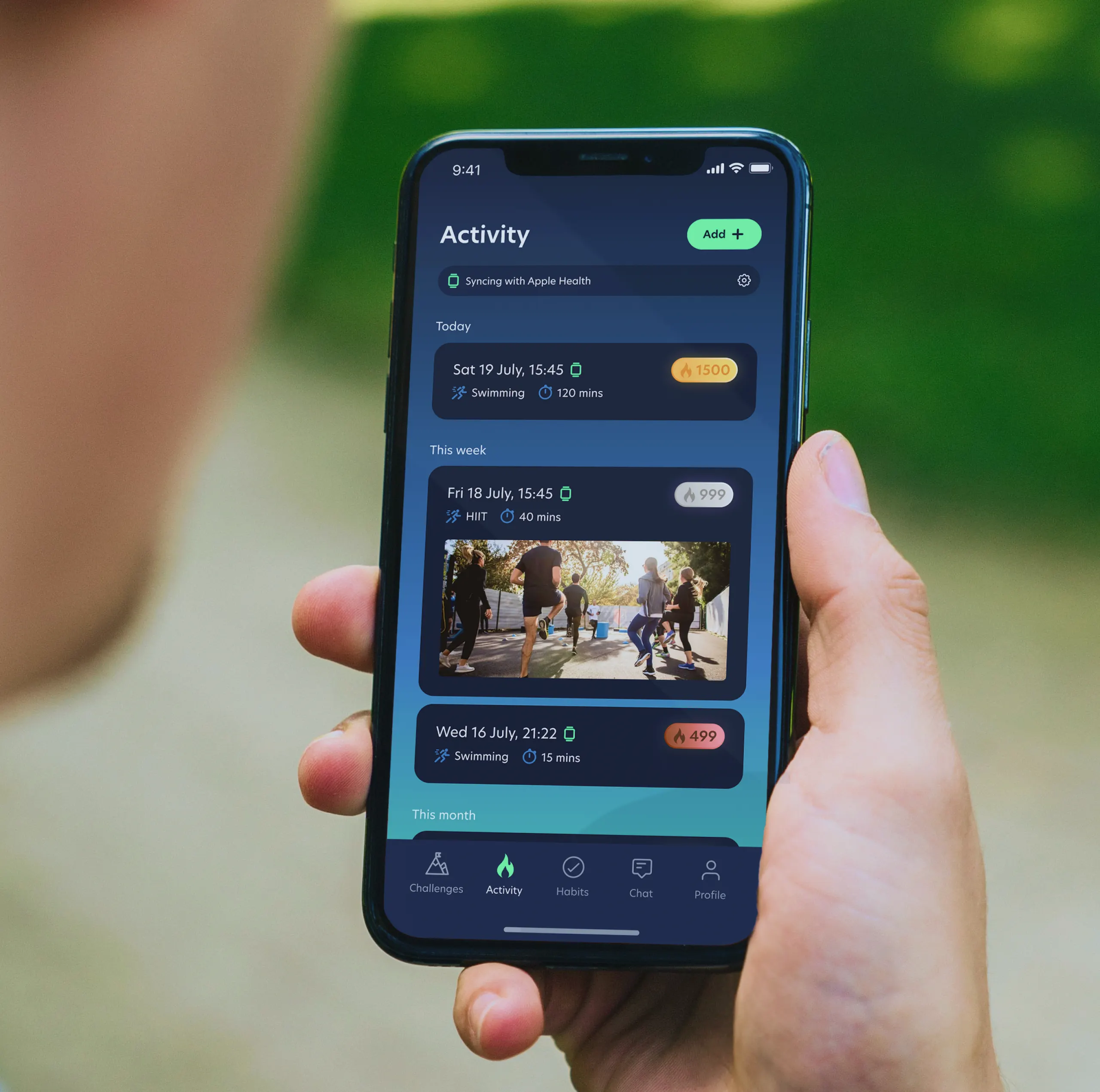
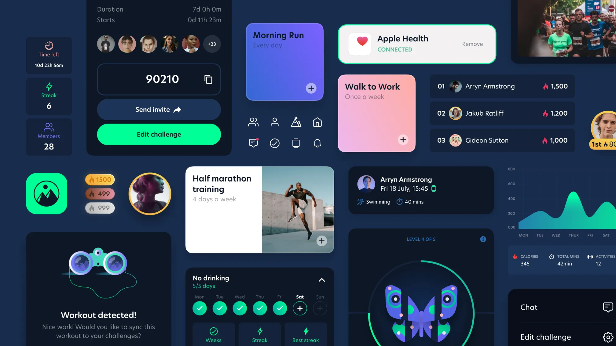
Magic Mountain is a social fitness and wellness app, intended to help people build healthier behaviours through the power of teamwork. The business had gained traction with a quickly-built launch version of its app—but to reach the next level of growth, they realised they had to move up to a much more thought-through and high-quality digital product.

The user interface (UI) did not resonate with most of the user base— lacking a premium feel of design maturity and refinement. There were also many instances where the user experience (UX) was complicated and illogical. As a result, the app’s user retention rate was dropping to 13% within a month—indicating lack of engagement with the product.
The company worked with Elsewhen to overhaul the app user experience (UX) and design new functionality—bringing additional value to the company and its customers. We worked to give the Magic Mountain app a fundamental overhaul. The design strategy had to be not only ambitious, but also realistic in scope.
We had a fixed 12-week timeframe to achieve this transformation in advance of Magic Mountain’s next meetings with investors.
Our approach was to manage the available time in a series of two- week phases. An initial discovery phase was followed by five sprints of design and development work, using Agile methodology.

In the research and discovery phase, we ran workshops to establish the current status and desired objectives. We conducted interviews with a range of app users to understand their experiences and opinions. Our team also assessed and prioritised project features in terms of the RICE framework—reach, impact, confidence and effort.
Our findings in the discovery phase made it clear that the app user experience and interface needed a full refresh. This called for substantial work—but this had to be a pragmatic update rather than a complete reinvention. We transformed Magic Mountain’s rough conceptual ideas into a functional product design. Our research into real-world use cases for the app helped shape an improve user flow.
At the end of the engagement, we conducted a design handover— empowering Magic Mountain to move the app forward in future. Users loved the improved UI and UX as well as the new features of the app. Magic Mountain is now ready for a new phase of user growth and investor attention—with an app that’s truly fit for the future.

